Responsive Vs Adaptive Website Designing in 2019
Responsive Vs Adaptive Website Designing Which One Is Best in 2019?
Getting tons of traffic and spending money on paid advertisements are useless if your website is not serving its users.
People hate a website that is hard to operate on mobile devices. In other words, if you are website is not mobile friendly then it’s going to cost you money as well as traffic.
The solution is pretty simple.
Build a website that opens on mobile devices (smartphone, iPhone, and Tab.)
There is only one problem.
Which one should you choose responsive or adaptive web design?
To help you with that we are going to provide you with the detailed analysis of Responsive and Adaptive web design that will help you take a better decision.
Why should you care about responsive and adaptive website design?
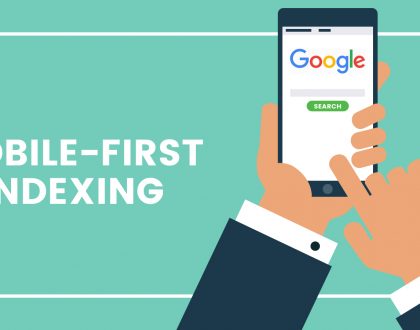
The way people are using mobile devices surprisingly increased in recent years so do accessing the website using mobile devices.
According to a study, mobile devices are projected to reach 79% of global internet use by the end of 2018. Additionally, mobile shares 51.2% global internet traffic as compared to desktop.
It means if your website is not serving mobile users you are leaving lots of money on the table.
Responsive and Adaptive web design can help you achieve your marketing goal.
Now let’s see them…
Difference between Responsive and Adaptive Web Design
Both web designs have a similar goal to build mobile-friendly websites and serve mobile users is a better way. But there are some differences that you need to know.
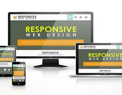
What is responsive web design?
Earlier web developers used to develop a separate mobile websites know M version to serve mobile users. However, that was a great idea at that time but not anymore.
You may ask why?
Building a separate mobile website means diving the traffic on two websites that is not good SEO best practice. Instead, build a website that serves both desktop and mobile users without costing you web traffic.
That’s Where Responsive Website Designing Comes to Play.
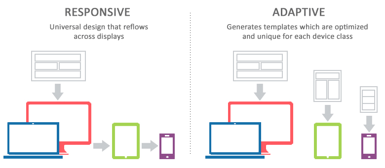
Responsive web design is following web designing best practices to design and develop a website that delivers content to the users as per their requirement not matter what devices screen, size, and operating system they are using.
Responsive web design practice contains a blend of flexible grids and layouts, images and an intelligent use of CSS media queries.
Responsive website adopts the screen sizes of the devices (desktop, laptop, mobile, tablet etc.) on which they are opening without making users scroll. It’s goal to provide the best user experience by minimizing the resizing, panning, and scrolling.
It can be possible because of the fluid grids used for building this layout which allows the design to work regardless of any screen size.
What is Adaptive Web Design?
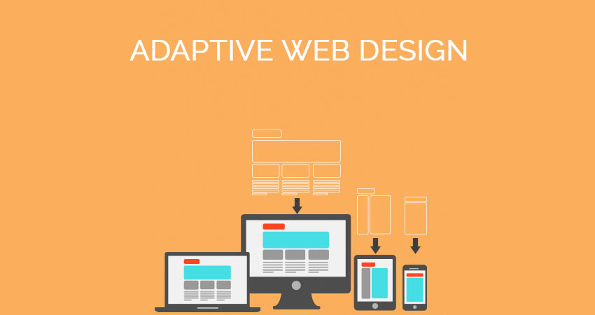
Adaptive web design also has the same intent as responsive website design to serve content to the mobile users. Adaptive web design practice demands create multiple versions of web pages that better fit according to the user’s device. Whereas when we follow responsive web design practice we develop only one website that serves users same on every device they are using.
AWD aims to deliver the best user experience available on a particular device like a laptop, PC, mobile, tablet, etc. as there are several version of layouts are available for each screen sizes.
Responsive vs Adaptive Web Design
By now we have understood the job of responsive web design and adaptive web design as well as how both designs work.
Now, let compare both design and its features that will help you take a better decision to choose which one is best for you.
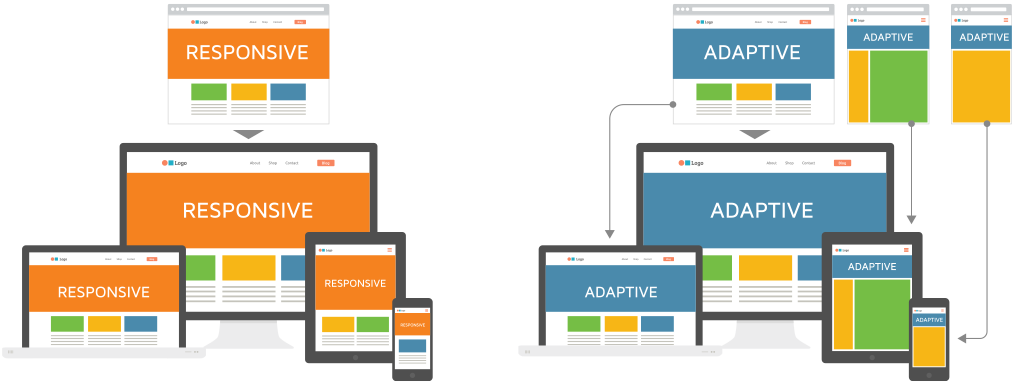
1- In RWD we use the same layout for all screen size while AWD there are different layouts according to the device and OS.
2- RWD is one size fits all type of the practice as you design only one layout for a single web page whereas AWD doesn’t follow this practice and you need to design multiple versions of layouts for a single web page.
3- Responsive design is not easy to build because you have to make one design for multiple devices while on adaptive web design multiple layouts according to the device.
4- Responsive web design is more flexible as compared to the adoptive website design. RWD can work on any screen size whereas AWD aims a single screen size.
5- Responsive web design is fast and loads quickly because it has to load a single layout while adoptive websites need to load entire possible layouts that take time to load.
6- Adoptive website design need more developers for handling the complexity as there are multiple layouts created that somehow increase the budget of web designing. On the other hand, if we talk about responsive website design then a single developer can easily take care of it.
7- Responsive website design is more SEO friends as compared to the adoptive website design. Therefore, if you have clients who want organic traffic then you should suggest him RWD.
Over to you!
We have done lots of research before writing this blog so you can know which design would be right for your responsive website design or adaptive website design.
However, both have their pros and cons it’s up to you which fit best in your need. In most cases, responsive website design is the best choice as it cuts down maintenance cost as well as help SEO.
And, if we talk about AWD then it is easy to create and allows developers to build the best possible UX for a particular website.
Graphics Merlin Studio is a leading responsive Website Designing Company in Delhi that provides affordable responsive web design services. Call us @ +91-8802143027 to get customized responsive web design quote.
Recommended Posts
Amazing Responsive Design Best Practices You Need To Know in 2019
October 22, 2018

8 Popular Word Press Themes That Will Improve Your SE Rankings!
February 6, 2018