Amazing Responsive Design Best Practices You Need To Know in 2019
You have a desktop at home and a mobile with you. Do you exactly find your experiences on both the devices same?
It’s a No, right?
That’s what we called it as “UX” or “User Experience”.
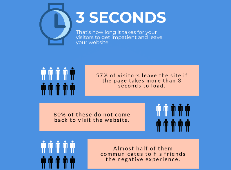
Do you know it takes less than 3 seconds for a website visitor to switch back due to bad user experience?
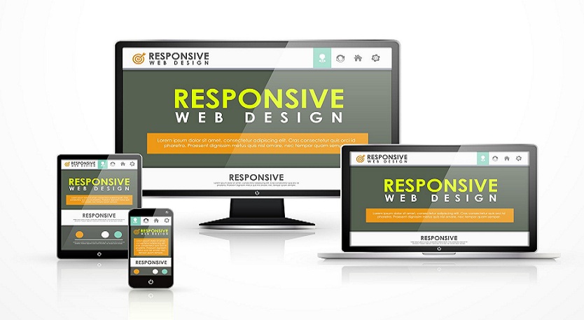
The concept of Responsive Web Design has taken over almost 95% of the websites in the world today.
Let me brief a little about it.
Responsive Web Design implies to the design of websites that fits according to the type of devices whether it is a mobile, a tablet, a laptop or a desktop.
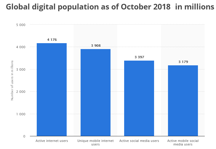
Nowadays people are switching on to hand-held devices for conducting their online searches. According to January 2018 data, the global mobile population amounted to 3.7 billion unique users.
Let’s discuss some responsive web design best practices to build stunning websites worldwide in 2019.
#1. Aligning Content Layout: Content is the voice of your business. Your content layout reflects the convenience of the visitor to know about you.
The more easily he navigates through the layout, the more interest he puts in it. Content layouts should be optimized for mobiles first.
#2. Use of Scalable Vector Graphics (SVG): As compared to other file formats like .png, .jpg, .jpeg etc., SVG’s are comparatively smaller in size and are highly scalable.
SVG’s icons or illustrations doesn’t affect the website’s loading speed and has a high resolution.
#3. Standard Button Sizes: You use a mouse click for desktop or laptop for checking in, but from the mobile point of view your thumb replaces the mouse.
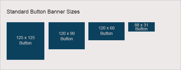
Your thumb becomes the navigator of your online search. Button sizes should accommodate the different thumb sizes for easy navigation
#4. Images should be responsive: Unlike SVG’s for icons and illustrations, photo images have larger file sizes because of textures, colors. This is why these types of images should be exported as. JPG because JPGs can be compressed to make the size of the file much smaller. Images should accommodate “fit to size” policy.
#5. Prioritize your content differently: Handheld device displays are comparatively smaller in size with desktops or laptops. Usually, people don’t look for a wholesome content on mobiles.
What can be done is-“Hide content “under tappable areas, content that is not-so-important for the user.
Instead of showing an entire section with its body text, you can show just the title, with a little supporting graphic that makes it interactive. At the point when this is tapped the full body content can show up, in either an overlay or with some kind of animation.
#6. Using Scalable Navigation: The most important part of a website in terms of responsiveness. Users should be given a direction in their route to discover their searched resources on the particular website they are in.
There are various forms of navigations. Some are listed below:
- Vertical Navigation
- Horizontal Navigation
- Slide out Menu
- Landing page
- Fixed Navigation
- Hamburger Menu (3 layers for smartphones)
- Responsive navigation
- Mega Menu
- Fat Footer
- Full-Screen Navigation
- Animated Navigation.
#7. Font Sizes: While writing content on your website, priority should be given to the size of the font you are using. No matter how small the font size, readability is important.
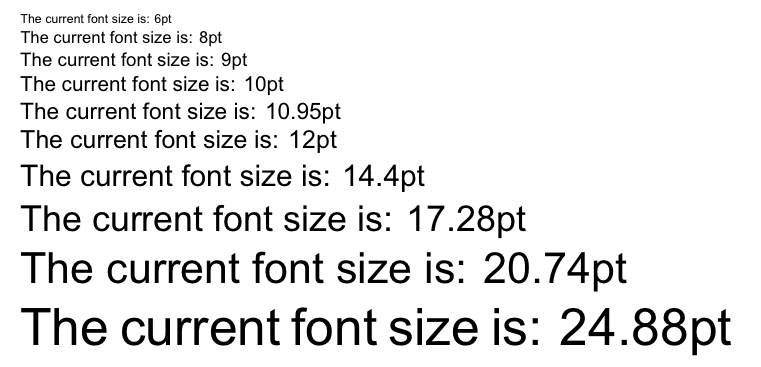
For a wider column of text, line-height should be more to find the start of the next line. 16 pt body text is an optimal standard size for all screen sizes. Headings should be 1.6 times larger as the text. The contrast and background colour should match with the font colour to enhance readability.
#8. Flat Designs: The benefit of a flat design website is that it easily adjusts to any screen size whenever it loads. Flat design is nothing but the use of 2D features or aesthetics. Even the buttons don’t look like a 3D one. It’s user-friendly and easy to design.
#9. Micro-Animations: Animations plays a primary role in improving the user experience. You can use the loading sequence to keep your visitor engaged on to your website. Animations usually hide the loading time of the website.
You can also use animation to make the user focus on a particular section where you intended to. Also, you can guide their navigation on your website through animations. Micro-animations provides a value to the content making the user experience clearer for the website visitor.
#10. ChatBots: The world has been seeing a surge in chatbots on websites or social sites.
What makes it so useful?
Let’s take a roundup. Chatbots have similar functionality as a customer care executive. But it has its specific advantages of a human form.
Let’s discuss it below:
- Availability: A chatbot is present all the time for service no matter it’s a holiday. They always obey commands given to them.
- User handling: As compared to human multi-tasking capability, a chatbot can attend thousands of customers at the same time which is impossible for a human.
- Cost Effective: Chatbots are relatively a low one-time cost for a website owner. You could integrate a customer support chatbot in your website to meet to simple customer queries.
- Customer satisfaction: Chatbots answers to client queries most politely no matter what mood the user is.
- Automation: Chatbots automate tasks which are to be done frequently and at the right time.
- As your personal secretary: Chatbots help the users to get a more personal touch. Also, the chatbot will remember all your choices and provide you with relevant choices the next time you visit it.
#11. Fluid Design: A fluid design format is a kind of web page design in which design of the page resizes as the window dimension is changed. This is refined by defining areas of the page utilizing percentages rather than fixed pixel widths.
We can declare max-widths to stop the content from becoming too wide while still leaving the website. Just by implementing a few boundaries, we can design a semi-fluid layout that works comfortably on any device.
#12. Using your Device hardware for UX: There are many ways where device hardware can help in developing user experience. Imagine the capabilities of your mobile phone. Let’s put in detail below:
- Camera scan: this feature is present in almost every smartphone where scanning (for example- credit card scan etc.) is done through it thereby saving time.
- Fingerprint scan: This feature lets user log-in with the need for typing.
- Facial recognition: authentication without the need to type.
- GPS: to determine the user’s location in real time.
- Also, you can add up a click-to-call action.
Thereby helps you to save time and effort.
#13. Testing on different actual devices: The final important step for responsive design breakpoints best practices is to test your website across multiple devices to check whether it meets all the requirements. Your website is a perfect design if you have tested in a large number of devices with diverse screen sizes.
#14. Resolution: Last but not the least the standard visual quality of a website across different devices depends on pixels you are using. Let’s go through some statistics for standard screen resolution used in India.
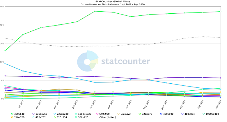
- 360 x 640 (small mobile screen) – 37.86%
- 1366 x 768 (Laptop screen) – 9.08%
- 360 x 720 (Large desktop) – 4.53%
- 720 x 1280 (Average mobile screen) – 4.19%
- 240 x 320 (Average desktop screen) – 2.89%
- 320 x 570 ( Large mobile screen) -2.46%
By now, I have covered all the best practices for responsive web design that will keep you ahead from others. If you are still confused you can talk to our web designers @ +91-8802143027 they would be happy to answer your all responsive web designing questions.
Recommended Posts
Responsive Vs Adaptive Website Designing in 2019
November 15, 2018

8 Popular Word Press Themes That Will Improve Your SE Rankings!
February 6, 2018
Fantastic Blog! I agree completely with you here.